Thursday, July 14, 2011

I've Moved!

It was high time for a blog upgrade, so I've moved over to tumblr.

My goals for the blog renovation:
-post more often
-take better pictures
-combine all my interests into one blog

designingaustin.tumblr.com

Tuesday, June 28, 2011

Little E's Room Transformation: The Longest Post ... Ever

It probably seems like I haven't been very active since April, but I've been slowly whittling away at Little E's room. For months, I've been scouring catalogs, magazines, websites, and anything else I could get my hands on for inspiration. Designing a room for a seven-year-old is tricky because kids change so much at this age. If we pick her favorite color to design around now, will she still like it in six months? Not to mention finding storage solutions for all the toys and childhood treasures.

So let's start with the before pictures. Feel free to judge me because I'm already judging myself :)
In fact, I didn't even bother to tidy the room before I snapped these pictures - so brace yourself before scrolling.

This first shot is the view from the doorway. Even Minnie has resigned herself to the mess.


Up next, is her American Girl furniture. Little E loves her dolls, and up until now, they've been sitting out in the middle of the floor.


This next picture was shot from the back corner of the room. We bought this desk thinking that it was not only cute, but that it had a bit of storage as well. Unfortunately, the desk became a giant kid's junk drawer. You don't want to see what was on the inside, believe me.


And here's a view of the closet. Another design-gone-wrong, I thought it would be a good idea to hang a lower rod and hang all of Little E's clothing. While she's very adept at removing clothing from hangers, you can imagine that it's a bit trickier (and unappealing) to hang everything back up again.


Phew! I feel like I've just been through a therapy session! It is not easy to post your mess for the whole internet to see. The only thing keeping me sane is knowing that you're about to scroll down and see the after pictures :)

There were only two criteria with this room overhaul:
1) We wanted to surprise Little E - which meant collecting things over time, hiding them, and then putting everything together at the very end.
2) We didn't want to get rid of anything. About a month ago, she asked that we remove her dollhouse from her room. Other than that, everything stayed.

We knew that E would be living at her mom's house over the weekend, which was the perfect time to put everything together. Here's JP, in the midst of the box furniture madness:


And here's "The XO" (E's fish), alone in an empty room:


And here's her new bed, all put together (thank you, Handyman Tom!):


We were relieved to finish all the furniture assembly by Saturday night, which meant we had all of Sunday to add the finishing touches. We had so much fun with this, and were really anticipating Little E's reaction. Would she like it? Would the shock of it overwhelm her? But as we neared the completed room, we realized it was perfectly suited to her. So without further ado...

The first views when you enter:


While the rest of the doll furniture is tucked away, we left the dresser & bunk bed out. Her grampa hand-built and painted these, and they are her favorites.

And here is the straight-on view from the doorway:


A few more gratuitous views of the bookshelf:


And while we're looking at the bookshelf, check out this label-making madness (as if we needed any further evidence that I'm my father's daughter):


Did we buy her a new keyboard? Why no, there just hadn't previously been room for it. So it sadly laid in her closet, waiting for the day when it would be played again.


And I had to atone for my previous misjudgment for her closet (oh yes, the label maker came out again):


And hooray for under-the-bed storage! An absolute lifesaver...


Little E discovered her new room last night and kept repeating to herself, "This room is so cool." She even appreciated my labels! My heart leaps!

Mission accomplished.

Friday, June 24, 2011

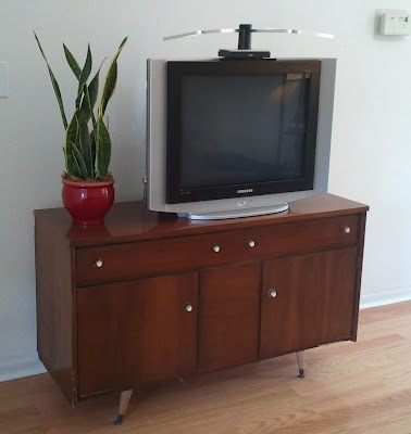
Living Room Console: Aka, Why I Love Craigslist

Do you remember this pic of our "media center" in the living room?


It's an image that has been slowly eating away at my brain for ... oh, the last three years. :)

I've known that the next tv console would likely be a temporary one, since we're hoping that whenever we do move, our living room will be a bit larger than our current one. But at the same time, I was ready upgrade from the current bench (with accompanying baskets full of video games and dvds). Imagine my glee when I discovered a mid-century design, media console on Craigslist. Sirens blaring! Choirs singing!


Ok, the image is super small here - but this posting literally made my heart leap! This console would be a perfect compliment to the modern feel of our sectional. I always think the best rooms tie together a few different styles and look collected over time.

As you might know, most of my readers are my family, who are in the furniture business. So as I write this, I'm imagining much shaking of heads at my excitement over a used, outdated piece. But I love it! And who would want to come in the way of furniture love?!?

So, I email the craigslist people. And then I wait. And wait. Four hours later, the posting is still listed, but there's no response. This is like waiting a year in Craigslist time. I know someone else has claimed my beloved console. So I email them and offer them a (slightly) higher price than the listing. An hour later, we have already talked to our new Craigslist BFF's and Jonathon and I are driving to east Austin, hoping that our prospective treasure will fit in my car.

Let me conclude by saying that this is one of those stories that has a happy ending. Hooray! (Side note: the console does need a bit of refurbishing, but that's another post for another day)


Tuesday, April 19, 2011

Throw Pillows

Our living room is ready for step two, personality. It's ready to move beyond functional and into some kind of representation of our home.

I'm not really sure where I should start...wall art? Throw pillows? Side Tables? Floor lighting?

However, I do know where I want to start. Throw pillows! I've been spending a lot of time over at Sweet Nature Designs' Etsy page. Check out the fun:


These next two are from pillowsandthrows.com:


I'm obviously digging on the persimmon color right now. It's so fresh and vibrant, and it would add a lot of energy to our very neutral living room. I've learned that a little whimsy goes a long way, so I'm not sure that I'll end up going this bold.

Any advice on next steps?

Monday, April 4, 2011

Maybe I'll Make Some Tea...

Yep! I'm still procrastinating on the backyard. However, I think we all can agree that the front yard is more important. So let's just ignore the back for a while, shall we?

I haven't put up a picture of the front of the house yet, so here she is, in all of her 920 sq. foot glory!
(I am dying to paint the exterior, btdubs.) This picture was snapped a year ago, when we put our house on the market. At the time, I randomly planted some flowers and shrubs from Lowe's and kept my fingers crossed that they'd survive until someone else moved in.

As it turns out, we decided to stay. And even though our house may be small, I love living here. So we're working with what we've got, as they say.

And believe it or not, I actually kept A-L-L of those plants alive until about December. And then, I'm not really sure what happened. My watering schedule started to wane, but I also found some grub worms in my soil, and then it also could have been the neighborhood cats, who are, much to my chagrin, privy to relieving themselves in our flower bed. For those of you wondering why I never planted a vegetable garden, now you know. :)

Back to the present, here is what the front looked like on Friday afternoon:


Not much left, except for the Japanese boxwoods and rosemary (which is completely un-killable in Texas).

Saturday morning, I took a trip to the plant store and came back with my loot:


I tried to go for lots of color, as well as varying heights and widths. Everything pictured is Texas native, low water (once established), and perennial (which means it's supposed to come back every year, if I do my job right).

Step One! Prepare the soil (you're supposed to do this about 2-3 weeks before planting, but the plant store expert assured me that I'd be ok).

First, I removed all the dead plants and pulled back the mulch. Then I tilled the old soil. And finally, I combined one part organic compost with one part topsoil and tilled the mixture into my old soil. Oh yeah, and then I watered the beds to prevent shock.

Where did all the boxwood shrubs go? They're in the process of being reassigned to the backyard. [Insert wild-eyed gaze here.]

Step Two! Plant the plants!


Little E helped decide where they should be placed. She was very curious throughout the process and kept checking-up on me. She did not, at all, enjoy the smell of the compost. It's an acquired smell, I suppose.

See that pretty little blooming tree thingy? That's a hibiscus! I'd love to make some hibiscus mint tea - doesn't that sound amazing?!? I'm not at all sure if this is the right variety of hibiscus, but I've got my fingers crossed!

And Step Three! I put down chicken wire:


Whaaa? But, why? Remember earlier, when I hinted at there being a cat problem? Apparently, cats don't like chicken wire because it prevents them from scratching and digging in the dirt.

The plant store expert also advised that I wait to mulch for another 2-4 weeks. Apparently mulch takes the nutrients out of the soil! Who knew? However, I'm hoping that a thin layer of mulch will neatly hide the chicken wire without enticing the cats back over. I'll keep you posted!

Friday, April 1, 2011

Planning: Another Way to Delay Action!

If you are a crazy planner like I am, or if you are thrilled by pictures of dirt, then this is the post for you!

In my zany hope to create a garden that thrives, I need to know what kind of sun/shade my backyard gets. And what follows are pictures taken throughout the day. (There is a lot of hard labor ahead of me, might I be procrastinating with all this planning?)

Here's my yard at 9am:


And here we are at 1:30pm:


And these last two were taken at 5pm:


So it appears that the whole yard gets roughly 6 hours of sun each day (the far side gets sun in the morning and the near side gets sun in the afternoon). In order to plant "full sun," I need 6+ hours of sun each day. Naturally, my yard is right on the cusp. Is Mother Nature trying to confuse me?

I guess a trip to the Natural Gardener is in order!

Thursday, March 31, 2011

Living Room Tour: March 2011

Check it out! I finally have updated pics of my living room!

It could be fun to do a little house tour, one room at a time. And since the living room is the entryway into our humble abode, let's start there!


After walking in the front door, this is the first view you would see of the house. Sure, it's a little bland, but I'm looking at the neutral tones as an opportunity to amp up the color with wall art and pillows. I haven't decided on the color palette yet. A fiery red could go really well with the grey. I'd love to see something bold like the throw pillows (below) from Martha Stewart's site:


Can you tell that my taste is ADD? I am seriously all over the place!

Moving on ... this is the view you would have over your right shoulder from the entryway.


I reupholstered these chairs when we first got them three years ago. I recently stripped the fabric off of one of them to make sure it wasn't more difficult than I'd remembered, which hopefully explains why they're in two different fabrics. For the next project here, I'm hoping to refinish the wood in a darker stain and reupholster them (yes, again). Now I just need to find the perfect fabric...


And above is the view of our tv. Not so exciting, but I wanted to show yet another barren wall and voice my intention of picking out a proper tv stand. See those wicker baskets full of dvds? Those puppies have got to go!

Here's the view of the kitchen from the sofa:


I'm keeping it real for you by not tidying up the kitchen before snapping the picture. That was totally intentional. :)

And here's my final shot from the kitchen. The picture turned out super dark, and I used all the photoshop tools I had to bring it back to life. Sadly, it's still pretty grainy, but I think it gets the point across.


And just to give you an idea of the progress, here's a shot from May 2010:


We've come a long way, no? So here's my 2011 list of action items for the living room:
Refinish chairs
Reupholster chairs
Find wall art
Declutter book shelves
Find tv console
Find throw pillows
Hang blinds/add molding to window (a whole post in itself)
Paint the walls (any suggestions?)
Replace the floor lighting
Find a side table (for in between the chairs)

And that wraps up the living room tour! Lots done and lots more to do!